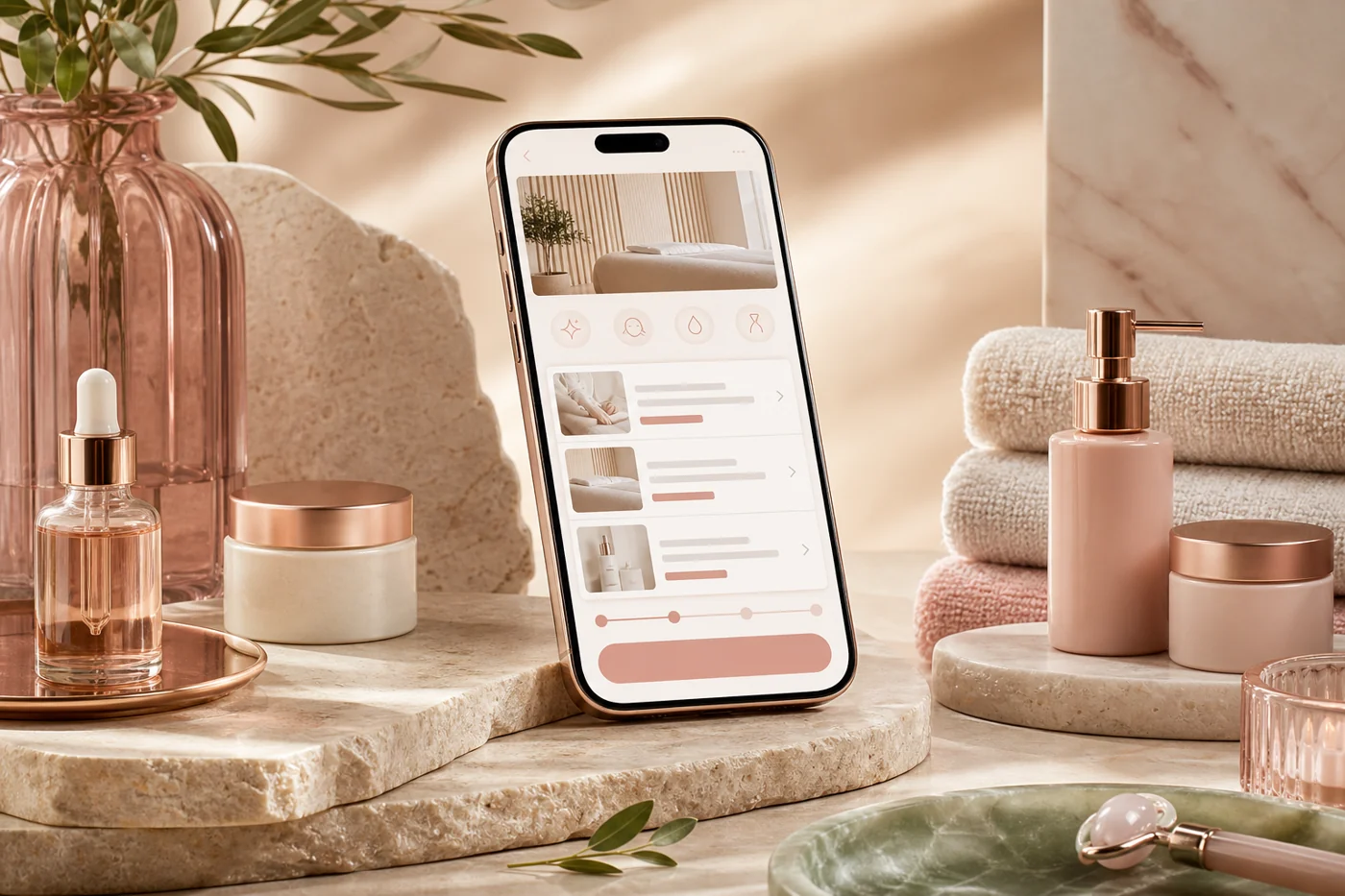
The Problem
The Derma Loft is a high-end medical spa with a loyal in-person clientele - and a digital booking experience that was driving people away. Their mobile app had a 38% checkout abandonment rate. Most common review complaint: "confusing," "takes too long," "I just call instead."
For a luxury brand whose in-person experience is meticulously crafted, the app felt like an entirely different business. The UX mismatch was hurting both revenue and brand perception.
Research
- Session recording review: identified exact screens where 62% of abandonments happened (service selection + add-on screens)
- 5 user interviews with existing clients about expectations for a luxury spa booking experience
- Competitive audit of 8 luxury wellness brands (Heyday, Milk + Honey, Hand & Stone, etc.)
- Heuristic evaluation against Nielsen's 10 usability principles
"The app doesn't feel like The Derma Loft. It feels like booking a dentist appointment."
- Existing client, interviewWhat Confused Users
- Clinical jargon in service descriptions
- Add-ons presented as a wall of checkboxes
- No booking summary until final screen
- Couldn't see provider availability upfront
What Users Wanted
- Plain-language descriptions + "right for you if..." guides
- A sense of luxury, even in the digital flow
- Transparency: prep, timing, aftercare expectations
- A booking experience that felt personal, not transactional
What I Redesigned
Service Descriptions That Actually Help
Before
"Microcurrent facial stimulates ATP production for enhanced cellular turnover."
After
"Microcurrent Lift - Tones and sculpts your face using gentle electrical currents. Right for you if you're looking for a non-injectable alternative."
Progressive Add-On Flow
Moved from a checkbox wall to one add-on per screen. Framing shifted from "Would you like to add?" to "Pair it with..." - add-on uptake increased 23%.
Persistent Booking Summary
Added a persistent summary drawer at the bottom of every booking step. No more surprise at final checkout. This single change drove measurable reduction in late-stage abandonment.
The real breakthrough wasn't visual.
The shift came from restructuring user decision moments and reducing friction before action. Content hierarchy did more heavy lifting than design.
What Changed
- Clear entry points reduced hesitation
- Microcopy reframed uncertainty
- Navigation mirrored mental models
- Trust signals surfaced earlier
Results
"Finally - the app is actually easy to use and feels like Derma Loft now. The service descriptions are so much clearer."
- App Store review, 3 weeks post-launchKey Takeaway: This project is a reminder that content design isn't cosmetic - it's structural. The visual design was already clean. The copy was broken. Every service description rewrite was a UX intervention. The 47% increase came from words, not pixels.